10 minutes
Building Game UI Systems That Stay Modular
Game UI has a habit of growing sideways.
A pause menu becomes save/load, controller prompts, an options screen, notifications, a store, a battle HUD, and suddenly one class knows about every button in the game and half the gameplay systems too. The layer that should have been simple now contains navigation, business rules, scene lookup, and a pile of one-off exceptions.
That is the point where UI stops being a layer and turns into a junk drawer.
The fix is not cleverness. The fix is to stop letting UI objects do three jobs at once.
The shape worth aiming for
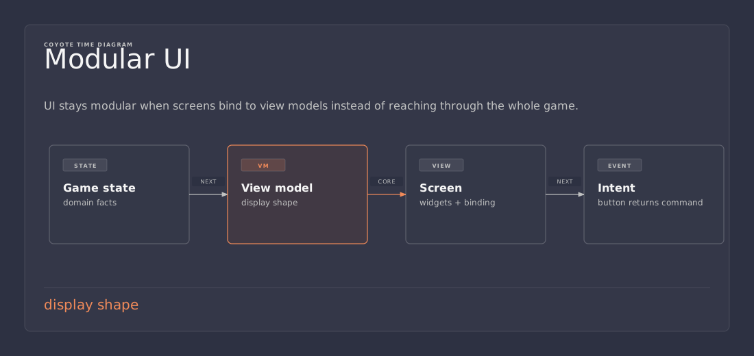
A modular game UI usually keeps four concerns separate:
- flow control decides which screen is active
- presentation logic decides what the UI should show and how it reacts
- views draw the widgets and raise user events
- services and game state live outside the UI layer
That split is not academic. It keeps the UI from becoming the place where navigation, business rules, and scene lookup all meet and start fighting.
Unity’s MVVM documentation makes the same separation in different words: the view is for display, the viewmodel contains the logic, and the model is the data. The Game Developer article on Unity UI architecture makes a similar point with screens, layers, and widgets: compose the system, keep the rest of the game agnostic, and do not let random code reach into the internals.
That is the model worth copying.
Keep the view dumb
The view should not decide whether the game is paused, whether the player can afford an item, or whether a mission is complete.
Its job is narrower:
- show state
- raise intent
- stay out of the rules
A bad UI script usually starts by being convenient and ends by owning everything.
public class PauseButton : MonoBehaviour
{
    public void OnClickResume()
    {
        Time.timeScale = 1f;
        AudioListener.pause = false;
        GameManager.Instance.SetPaused(false);
        FindObjectOfType<MenuStack>().CloseAll();
    }
}
That is easy to write and hard to maintain.
The button knows about time, audio, game flow, and menu management. If any one of those systems changes, the button has to be remembered too. The button is now part of the architecture instead of part of the presentation.
A better version pushes the reaction out into a presenter or controller:
public interface IPauseMenuView
{
    event Action ResumeClicked;
    event Action OptionsClicked;
    void SetPaused(bool paused);
}

public sealed class PauseMenuPresenter
{
    private readonly IPauseMenuView _view;
    private readonly IGameFlow _gameFlow;

    public PauseMenuPresenter(IPauseMenuView view, IGameFlow gameFlow)
    {
        _view = view;
        _gameFlow = gameFlow;

        _view.ResumeClicked += OnResumeClicked;
    }

    private void OnResumeClicked()
    {
        _gameFlow.ResumeGame();
    }
}
Now the view is just a view. The presenter owns the reaction. The game flow object owns the rule.
That is the whole trick.
Let one thing own navigation
A lot of UI spaghetti comes from letting every screen open and close every other screen directly.
That design gets messy fast.
One place should own screen flow. Sometimes that is a menu stack. Sometimes it is a small router. Sometimes it is a state machine. The exact shape matters less than the rule: the screen itself should not be responsible for the whole screen graph.
When a settings panel can open the pause menu, and the pause menu can open the store, and the store can close the HUD, the code stops being local. Every menu becomes a transit hub.
A better version looks like this:
- the button raises an event
- the presenter decides what that event means
- the flow controller opens or closes the next screen
- the view reflects the current state
That structure is boring, and that is praise. Boring UI code is easier to move, easier to test, and easier to delete when the feature changes.
Use events for changes, not polling for everything
UI code that polls everything every frame is still common because it is easy to write once.
That is usually a mistake.
If a health label changes only when health changes, update it when health changes. If the currency display changes only after a reward, push the new value once instead of rebuilding text 60 times a second. If the inventory count changed, notify the view. If it did not change, leave it alone.
Event-driven UI has a few practical benefits:
- less per-frame work
- fewer accidental dependencies
- clearer data flow
- easier profiling when the UI gets heavy
This matters in games because UI often gets glued to hot paths without anyone noticing. A menu that rebuilds itself every tick is not a crisis in a tiny prototype. In a live game with layered HUDs, animation, localization, and platform prompts, it adds up fast.
If a constantly updating element is necessary, isolate it on purpose. Do not let it spread the habit to the rest of the UI.
Reuse widgets, not screen controllers
Reusable widgets are useful, but the reuse has to stay narrow.
A button row, inventory slot, tab strip, tooltip, or player card should usually be a small component with a clear job. That part of the UI is worth reusing because the behavior is stable.
A whole screen controller is often too specific to reuse cleanly.
That distinction matters because the easiest way to make UI “modular” is to move the mess into a base class and hope nobody notices. That shortcut ages badly. It creates an inheritance tree that looks tidy until the first feature branch needs a slightly different screen flow and the whole thing starts bending.
Composition is usually the cleaner answer. Several small components that each own one piece of behavior are easier to understand than one inherited monster that tries to be every menu in the game.
For different menu layouts, assemble them from the same widgets and the same presenters. That keeps the surface area small.
Ownership is the real design question
Most UI mistakes are really ownership mistakes.
The useful questions are:
- who owns this state?
- who is allowed to change it?
- who should react when it changes?
- who cleans it up?
If those answers are hard to find, the UI architecture is already paying interest.
That is why hidden singletons, scene searches, and direct references into gameplay code cause so much pain. They blur the boundaries. A button should not need to know how to find the system that will do the real work. A screen should not have to discover the inventory manager by rummaging through the scene. A widget should not be the place where the game rules hide.
A better structure keeps those dependencies explicit and narrow.
A practical screen flow example
A game with pause, settings, inventory, and store screens can stay manageable if the responsibilities stay separate.
One possible shape is:
- a
ScreenFlowControllerowns which screen is on top - each screen exposes events like
ContinueClickedorBackClicked - each presenter listens to the view and tells the flow controller what should happen
- the flow controller does not care how the screen was drawn
- the screen does not care how the navigation stack works
That separation makes the UI easier to refactor. If the pause menu turns into a modal stack tomorrow, only the flow layer changes. If the skin of the inventory screen changes, the presenter and flow logic can stay intact.
The result is not less code because the UI is simple. The result is better code because the UI can change without dragging the whole project with it.
Keep game logic out of the widget tree
The easiest way to create fragile UI is to let a widget perform game logic directly.
A button handler should not open save files, decide whether a mission is complete, validate prices, and update the HUD in one place. That is too much responsibility for a view.
The useful split is:
- the widget raises an event
- the presenter turns the event into an action
- the service or game system performs the action
- the presenter or view updates based on the result
That shape also makes testing easier. A presenter with a fake view and fake service can be checked without loading an entire scene. A direct button script buried in scene objects is much harder to exercise cleanly.
Rebuild only what changed
Another common UI problem is rebuilding more of the screen than necessary.
If a health value changes, the health label should update. The whole HUD does not need to be recreated. If the selected tab changes, the visible panel can swap. The entire menu graph does not need to be torn down and rebuilt.
This is where modularity helps beyond readability. Smaller, focused components make it easier to update only what changed. That keeps the UI cheaper to run and easier to reason about when a frame spike appears.
The same principle applies to complex views:
- update one widget when one value changes
- refresh one panel when one state changes
- rebuild one screen only when the screen itself changes
That is the difference between responsive UI and expensive UI.
Localization and platform prompts belong in the right layer
UI often becomes fragile when it starts mixing content, presentation, and platform-specific concerns.
Localization strings should not be hardcoded inside button callbacks. Platform button prompts should not be scattered across gameplay scripts. Input hint mapping should not live in the same place as inventory logic.
Those concerns are part of presentation, but they are not the same as the widget tree. They belong in the layer that formats what the user sees, not in the layer that decides the game’s rules.
Keeping that distinction clear saves a lot of late-project pain when the game needs controller prompts, keyboard prompts, language switching, or accessibility changes.
What not to do
There are a few shortcuts that feel efficient and almost always become debt:
- reaching into gameplay singletons from button handlers
- letting UI code search the scene for dependencies
- putting save/load logic directly in widgets
- mixing animation timing, navigation, and data formatting in one class
- building a universal menu base before the screens actually share behavior
- polling every value every frame when events would do the job
The common problem is not style. It is ownership.
When one class knows too much, it becomes hard to answer simple questions like: who owns this state, who is allowed to replace it, and who cleans it up?
If those questions are hard to answer quickly, the architecture is already paying interest.
A practical rule of thumb
When it is unclear whether something belongs in the UI, ask one question:
Does this code describe how the UI looks, or does it decide what the game means?
If it is mostly look and interaction wiring, it belongs close to the view. If it is about rules, flow, or state changes, it belongs outside the view.
That one line catches most of the mistakes in game UI code.
The tradeoff is worth it
This structure is a little more work up front than wiring buttons directly to gameplay methods.
It is worth it once the project has more than a couple of screens.
The point is not elegance for its own sake. The point is survivability. UI changes constantly. Those changes should stay local. A menu system that can evolve without dragging half the game with it is worth a small amount of ceremony.
Not a cathedral. Just enough structure to keep the walls from collapsing.
Practical takeaway
If the goal is modular, maintainable game UI, keep the responsibilities separate:
- a flow controller owns navigation
- a presenter or controller owns reactions
- a view owns rendering and input events
- services and game state stay outside the UI layer
That is usually enough to keep menus, HUDs, and in-game widgets from turning into a pile of hidden dependencies.
References
- Unity Manual, Comparison of UI systems in Unity
- Unity App UI, Introduction to the MVVM Pattern
- Yanko Oliveira, A UI System Architecture and Workflow for Unity
- Robert Nystrom, Observer